6 个版本
| 0.1.6 | 2024 年 5 月 9 日 |
|---|---|
| 0.1.5 | 2024 年 5 月 8 日 |
#399 in 可视化
1.5MB
34K SLoC
Apexcharts-rs
![]()
这是一个使用 ApexCharts JavaScript 库生成图表的 Rust WASM 绑定。该库提供了使用 yew 和 leptos 框架创建图表的组件。ApexCharts 是一个现代的开源图表库,帮助开发者为网页创建美丽且交互式的可视化。
浏览器支持
 Firefox |
 Chrome |
 Safari |
 Edge |
 IE11 |
|---|---|---|---|---|
| 31+ ✔ | 35+ ✔ | 6+ ✔ | Edge ✔ | (IE11) ✔ |
使用方法
根据使用的框架启用功能,可以公开组件供使用。
-
Yew
[dependencies]
apexcharts-rs = {version="0.1", features=["yew"]}
然后在你的代码中
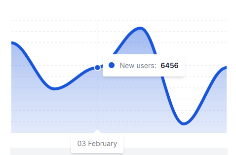
use yew::prelude::*; use apexcharts_rs::prelude::{ApexChartComponent, ChartType, ChartSeries, SeriesData}; #[function_component] fn MyApp() -> Html { // This is the data to chart. The data is a vector of `ChartSeries` // which contains the name of the series, the data points, color, type // and z-index. Note that different charts require different data types. let series = vec![ ChartSeries { name: "New users".to_string(), data: SeriesData::Single(vec![6500, 6418, 6456, 6526, 6356, 6456]), color: "#1A56DB".to_string(), r#type: None, z_index: None, } ]; // Options to further configure how the chart looks. Kindly refer to the ApexCharts documentation for more options. let raw_options = r##"{ "chart": { "fontFamily": "Inter, sans-serif", "dropShadow": { "enabled": false }, "toolbar": { "show": false } }, "xaxis": { "categories": ["01 February", "02 February", "03 February", "04 February", "05 February", "06 February", "07 February"], "labels": { "show": false }, "axisBorder": { "show": false }, "axisTicks": { "show": false } }, "yaxis": { "show": false }, "legend": { "show": false }, "stroke": { "width": 6, "curve": "smooth" }, "grid": { "show": true, "strokeDashArray": 4, "padding": { "left": 2, "right": 2, "top": 0 } }, "dataLabels": { "enabled": false }, "tooltip": { "enabled": true, "x": { "show": false } } }"##; html! { <div> <ApexChartComponent options={raw_options.to_string()} r#type={ChartType::Area} id={"chart1".to_string()} series={series.clone()} /> </div> } } pub fn main() { yew::Renderer::<MyApp>::new().render(); } -
Leptos
[dependencies]
apexcharts-rs = { version="0.1", features=["leptos"] }
然后在你的代码中
use leptos::*;
use apexcharts_rs::prelude::{ApexChartComponent, ChartType, ChartSeries, SeriesData};

#[component]
fn MyApp() -> impl IntoView {
    // This is the data to chart. The data is a vector of `ChartSeries`
    // which contains the name of the series, the data points, color, type
    // and z-index. Note that different charts require different data types.
    let series = vec![
        ChartSeries {
            name: "New users".to_string(),
            data: SeriesData::Single(vec![6500, 6418, 6456, 6526, 6356, 6456]),
            color: "#1A56DB".to_string(),
            r#type: None,
            z_index: None,
        }
    ];

    // Options to further configure how the chart looks. Kindly refer to the ApexCharts documentation for more options.
    let raw_options = r##"{
      "chart": {
        "fontFamily": "Inter, sans-serif",
        "dropShadow": {
          "enabled": false
        },
        "toolbar": {
          "show": false
        }
      },
      "xaxis": {
        "categories": ["01 February", "02 February", "03 February", "04 February", "05 February", "06 February", "07 February"],
        "labels": {
          "show": false
        },
        "axisBorder": {
          "show": false
        },
        "axisTicks": {
          "show": false
        }
      },
        "yaxis": {
            "show": false
        },
        "legend": {
            "show": false
        },
      "stroke": {
        "width": 6,
        "curve": "smooth"
      },
      "grid": {
        "show": true,
        "strokeDashArray": 4,
        "padding": {
          "left": 2,
          "right": 2,
          "top": 0
        }
      },
      "dataLabels": {
        "enabled": false
      },
      "tooltip": {
        "enabled": true,
        "x": {
          "show": false
        }
      }
    }"##;
    let (series, _) = create_signal(series);

    view! {
        <div>
            <ApexChartComponent
                options={raw_options.to_string()}
                r#type={ChartType::Area}
                id={"chart1".to_string()}
                series={series}
            />
        </div>
    }
}

pub fn main() {
  mount_to_body(MyApp);
}
上面的代码将渲染以下图表
要在单个图表中组合多个系列,可以将更多的 ChartSeries 添加到 series 向量中。
当前支持的图表
- 区域图
- 折线图
- 柱状图
- 条形图
- 饼图
- 环形图
- 径向条形图
- 热力图
- 蜡烛图
- 雷达图
- 极坐标区域图
- 气泡图
- 散点图
- 树形图
- 箱线图
- 范围条形图
系列数据
SeriesData 枚举用于表示图表的数据点。数据点可以是单个值或两个值的元组。数据点可以表示如下
use apexcharts_rs::prelude::SeriesData;

let data = SeriesData::Single(vec![6500, 6418, 6456, 6526, 6356, 6456]);

// or


let data = SeriesData::CategoryPaired(vec![
    ("01 February".to_string(), 6500),
    ("02 February".to_string(), 6418),
    ("03 February".to_string(), 6456),
    ("04 February".to_string(), 6526),
    ("05 February".to_string(), 6356),
    ("06 February".to_string(), 6456),
]);

// or

// Note that this data format should only be used for the Radial Charts
// like Pie Chart, Donut Chart, and Radial Bar Chart. The sum of the values
// should be 100.
let data = SeriesData::Radial(vec![
    ("Rent".to_string(), 42.0),
    ("Gas".to_string(), 12.4),
    ("Electricity".to_string(), 8.4),
    ("Food".to_string(), 11.2),
    ("Clothes".to_string(), 9.5),
    ("Entertainment".to_string(), 16.5),
]);
不同的图表可能需要不同的数据格式。请参阅 ApexCharts 文档以获取更多信息。
更多示例请查看 示例目录。
许可证
本项目采用 Apache License 2.0 许可 - 有关详细信息,请参阅 LICENSE 文件
依赖项
~2–15MB
~185K SLoC